Photographs: iStock
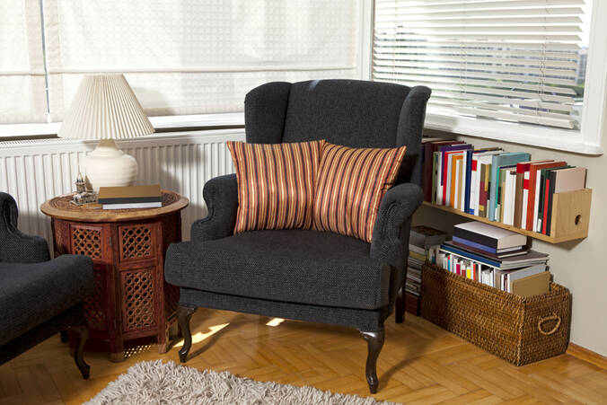
1. The essentials: The singlemost important part of any reading corner is undeniably the seating. Choose the posture you are most comfortable reading in, and hand-pick furniture to go with it.Like the old-school table and chair? Prefer a cozy little nook to lie down in? A bean-bag, leather recliner, vintage armchair or sometimes even a swing could help create that perfect set-up.
2. Where's the view?: Love reading by the window-side? You could pick the view you prefer most and design your corner around it. A lot of us read right before falling asleep – many use the bedside table as a study desk with provision for books which they can easily reach while in bed.
3. A splash of colour: A collection of books can tend to be quite colourful – a neutral or white backdrop will help it to stand out. If you would like to go the other way, you could create a dramatic bookshelf backdrop to steal the focus, usinga vivid illustration perhaps depicted in one of your favourite books, within which you subtly display your collection.
4. No place for fairy tales?: Have children at home? How about creating a corner especially for them – you could use wallpapers, table lamps, seating furniture and additional accessories inspired by objects from their favourite stories to create an immersive set-up so that they no longer run away from reading books.
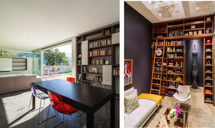
5. The vintage touch: If you prefer the serious, classic study with the touch of wood and leather, you could use conventional materials. You could go with a full-height neatly curated book wall, adding a sliding ladder to give it the feel of an old, traditional library, and highlight some parts of the space with functional accessories such as brass or copper lamps. If you are lucky enough to get your hands on some captivating works of art, you could compose your set-up around them, or enhance a specific wall with them – it's your call.
 (Left) A reading corner that's part of a kitchen. Neat sliding shutters save on space. The breakfast table doubles as a reading corner. (Right) If you can devote an entire room to a library, try going for a full-height book wall with a sliding ladder. Highlight some parts of the space with eye-catching accessories.
 7. Matters of order: Lastly, organizing and maintaining your book collection doesn't have to be an afterthought or a tedious task – you could give thought to the practical aspects while designing your reading corner. Sliding shutters made of glass panels with delicate, thin metal or wooden frames will keep your books on display and yet dust-free. Sliding shutters work well for areas with limited space – they can be designed flushed along the wall, or the study table, or the body of the bed, depending on where you would like to keep your books stored.


