Designer: Shailendra Raghuwanshi
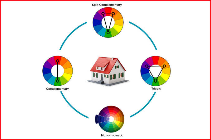
1. Monochromatic colour harmony: This is the simplest and the easiest colour scheme, in which any primary colour, for example blue, is taken and the entire space including the walls, articles, furniture, murals, etc are in the shades of blue with different hue and intensity.
2. Complementary colour harmony: For this colour scheme, two opposing colours such as blue and orange, and their different values and tones, are used in the room. Two different colours help the individual colour to brighten up so that every element can be identified individually. This colour scheme also gives a stronger appearance to the room and increases environment’s excitement as well. However, to handle this scheme, you should be quite an expert in handling monochromatic schemes.
3. Split complementary colour harmony: As the name suggests, two different colours such as blue and orange and two colours with same hue for orange, ie red and yellow are used.
4. Triadic colour harmony: In this colour scheme, three different colours like yellow, blue and red along with green, orange and violet are used. All the secondary colours create a triadic harmony, which can be used for extremely colorful purposes giving a festive like feeling (Holi).


