Photographs: Sebastian Zachariah; courtesy DIG Architects
Amit Khanolkar of DIG architects designs a residence in Mumbai. This creation sees perfect transitions between different spaces, a feeling that is evoked while moving through it.
1. Here, the living and dining spaces have been separated to give each function its own space. The shutter cladding has back painted glass and customized aluminum profile handle. Similarly, the storage/bar is designed in such a way that it doubles up as the partition between the living room and daughter's bedroom. To add a fun element to this space, customized artwork is displayed on the wall. The staircase section has a wooden finish cladded on steel sections with clear toughened-glass railings and acrylic sheet partition.

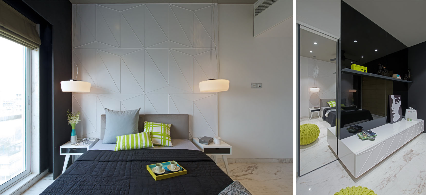
2. (Left) The master bedroom is in the shape of a long rectangle, which making the space look disproportionate. As a corrective measure, full height storage was designed and the headboard elevated. (Right) The son's bedroom was designed using horizontally arranged channels from aluminium C-sections in white PU finish..

3. This guest bedroom is very compactand adheres to the basic amenities. The highlight here is the dressing mirror which is designed like a sliding pocket door that remains hidden when not in use.

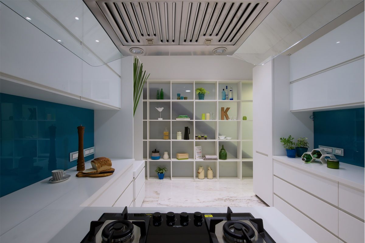
4. In the kitchen space, the island counter acts as a separation point between the service and cooking area. Here, the partition unit has been elevated and the shelves adorn a white laminate finish with plywood shelves.

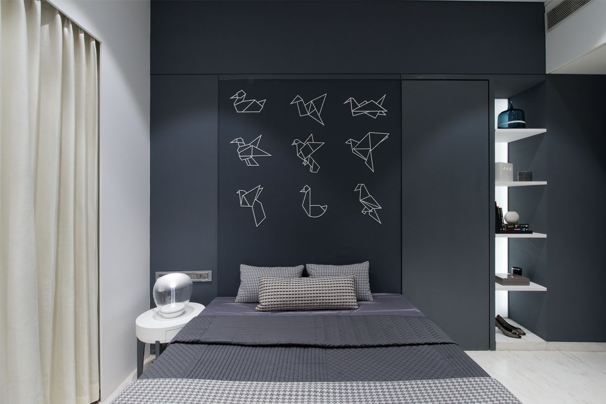
5. For the daughter's bedroom, the balcony space has been merged with the bedroom's primary layout and grey paint has been used for the display shelves.

6. The toilets for the guest bedroom and master bedroom have been merged into one to make way for one large bathroom that houses the walk in wardrobe for the master bedroom, resulting in a simpler plan for the bedroom.
E_SZ47684-Seamless-transformation-of-space.jpg)


E_SZ45964__1526436888.jpg)


